A digital world
powered by people.
DOHERTY ASSOCIATES are digital people. They are very much real people too. Their approach to B2B IT is refreshingly personal. They don’t bamboozle with technical bull. They are liked and trusted.
There is a perception that the IT sector is full of boring computer technicians wearing ill-fitting blue slacks and untucked shirts sat behind PC’s, working for companies with predominately blue/grey brand personalities. When I met the founder and CEO of Doherty Associates it was immediately clear the company was something very different. Understanding the core values of the organisation gave birth to this bright, sector challenging, brand identity.

It starts with the name, Doherty Associates. The associates are valued and trusted to form direct lines of communication with clients to ensure 100% service 24/7. It’s a team effect supported by a team attitude. And it comes from the very top of the organisation. The branding simply reflects the positive energy.
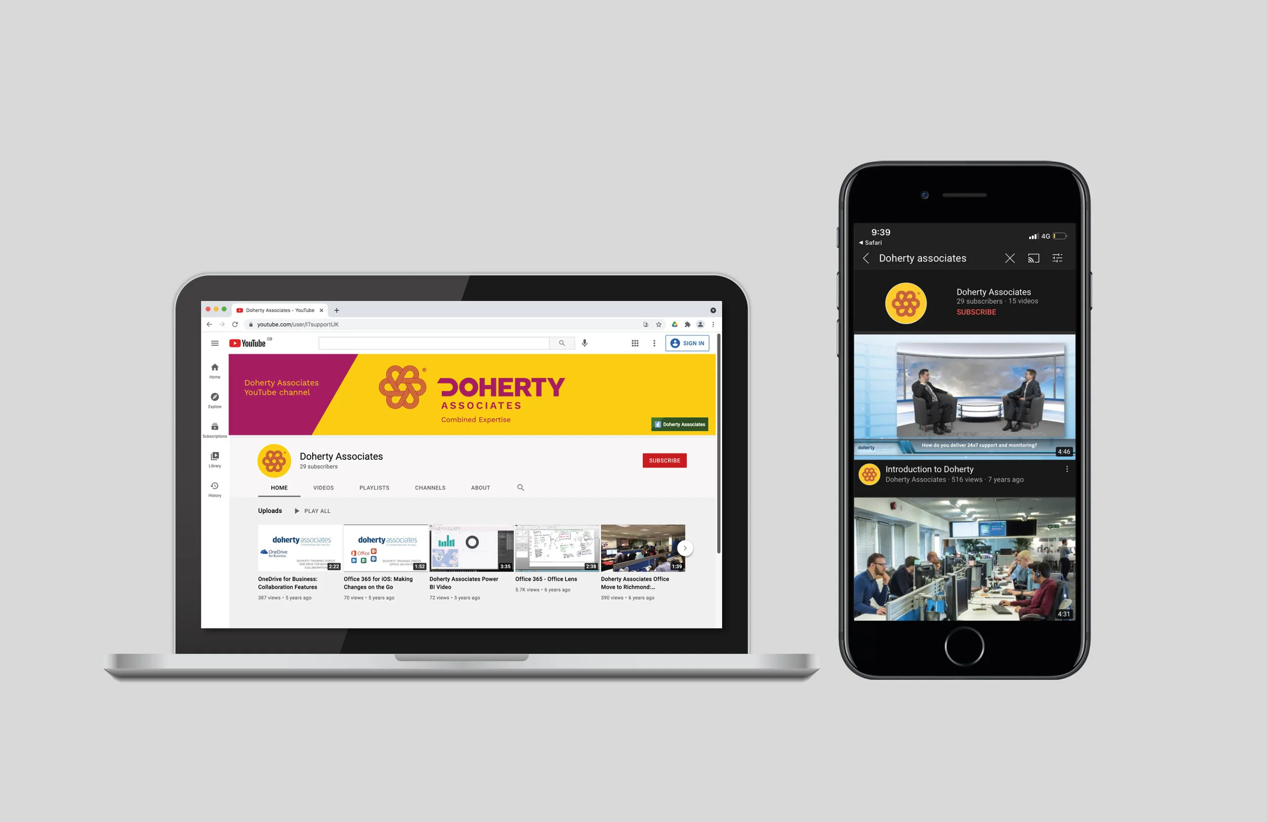
It is not just a logo. It is a unique visual identity that encapsulates the ‘truth’ - The initial letter ‘D’, of the name Doherty, is formed of multiple strands to illustrate that Doherty Associates has multiple strengths. In turn, multiple ‘D’s, that represent the team, are combined to create a unique, dynamic mnemonic. By using the brand guidelines consistently Doherty Associates confidently communicate its identity, to build recognition of who they are, what they stand for and what people can expect from them.